These are going to be the last drawings from my sketchbook for a while.
This is a character I made based on a random prompt from conceptstart.net. I started with the head (bottom, right), made a silhouette thumbnail, then drew the rest (left)(left) Random figures from imagination. (right) Figures from reference. When I do figures like these, I focus on the action, not the anatomy. So I use quick, loose lines. I also grip my pencil differently.And here’s a little something from my vacation these past two weeks. I was messing around in a vector program called Affinity Designer, and decided to composite the character into a random photo (not mine, CC0)
If you have any questions feel free to them ask them below.
You can follow me by clicking “Menu & Widgets” and clicking this button:
Hopefully I’ll have more to post soon. Follow if you want to see more.
Lots of style testing along with a few ink drawings (one of which is of my dog, Misty.)Warmup sketches and alternate pencil grip tests on the left with some poses.Far left are some early mechanical pencil drawings where I experimented with fine lines and less under-sketching. The rest is a mixture of dragons, marvel comic characters, and more random stuff. The far right mask is just a comic panel I thought was cool and copied down to see if I could keep the proportions.
If you have any questions feel free to them ask them below.
You can follow me by clicking “Menu & Widgets” and clicking this button:
I have a few more pages, and some logos that I might post. Make sure to follow if you want to see more.
More sketches for anyone who’s interested. Not much explanation needed, other than this first page, which is a character based on a voice done by comedian Tim Hawkins in his podcast Poddy Break. You can find the introduction to this character in episode 35 around 01:01:06. The character’s name is Crappaw and he likes to squeeze tennis balls. Other than that, these are just a combination of quick anatomy/pose sketches and a bunch of random characters for fun. Everything here was done with a mechanical pencil.
If you have any questions feel free to them ask them below.
You can follow me by clicking “Menu & Widgets” and clicking this button:
I will be posting more of these sketches soon, as I have a ton of these pages already scanned and didn’t think it would be good to fit everything into one post.
Here’s the second round of random sketches and concepts that have been piling up. Iv’e posted most of these in other places, but didn’t give them their own post here.
Couple of concept paintings here. Both are done more or less on a single layer, excepting some glow effects and sketch lines. I tried not to spend too much time on either, but they took longer than I would have liked. Rendering is something I need to practice more.
First I’ll show the Scarecrow, my favorite between the two images here:
I used a website called conceptstart.net for the idea. Scarecrow is a villain from the Batman DC comics, but the design isn’t that much different from a normal scarecrow, so it’s not necessarily fan-art.
Up next is a landscape that I randomly started painting. It’s more of a sketch than anything else. I’ve been having to do landscape backgrounds for a game recently, so that was probably the inspiration, to see what I could do outside of a paid situation. Personally, I don’t really like the result:
OriginalAdjusted
I should have focused more on the composition from the beginning. Unfortunately I just started painting a bunch of mountains and had to start from there. I’ll probably try something like this again to see if I can get a better result.
One more note: I added a new url to this site. So now there is the original jumpingmonkeyart.com, but also joshmillustration.com as well.
Some various sketches from my sketchbook with blue and normal graphite. They weren’t all on the same page, of course, I had to stitch the images together. If all my sketchbook pages looked like this…
So, this is my third sheet of silhouette sketches (Here’s a link to the first and second). This page contains a lot less as far as concepts, but I polished them up a little more than in the past, especially the mech, as you might have noticed.
A quick note on Inktober; I did quit after the first 17/31 days, which is unfortunate, but I was able to take on more freelance work as a result. Unfortunately I can’t show any of it yet, except for this logo I did a couple months ago, which never quite made it onto the blog.
I’ve been using it as a kind of example for others wanting prices and stuff when they come to me for a logo.
And that’s about it. Remember to like if you liked and follow if you want to see more. Feel free to comment as well, I appreciate all feedback.
I just finished last weekends drawings last night, so yeah; that’s why this is late.
Day 11: “Perhaps”
Day 12 sketch
Day 12 sketch
Day 12 ink
Day 12 edit
Day 12 alt
Day 14-15: More head sketches
Day 16: Sailor
Day 17: “Sigh”
Day 16-17
Ideally I would have posted this on Sunday, but school and freelancing got busy and I was having trouble deciding what to draw.
I’m not particularly proud of any of these, but I think the way day 11 came out is interesting. It was probably the first time that I used my thicker pens and didn’t regret it.
Also, the last four days, which I did last night, are (partially) inked with my new Copic 0.03 tip pen. It’s really nice for details and small drawings at about half the size of my previously smallest pen. I wish I had it when I did day 12 to maybe make some grass or something to fill in the ground.
Anywho, that’s it for this week. Thanks for reading, and make sure to like and follow if you enjoyed my content.
An illustrator named Jake Parker started Inktober in 2009 as a personal challenge to improve his inking skills. Today, thousands of artists do the daily challenge by making ink drawings every day for the whole month of October. Here’s more information: http://mrjakeparker.com/about
I decided to give Inktober a shot this year, only to find out I had no idea what I was doing. I struggled through the first five drawings, pretty much hating everything I drew.
Warmup test
Day 1: Fast
Day 2
Day 3
Day 4: Batman
CLICK TO SEE SLIDESHOW
I got some blue lead for my mechanical pencil and began to see improvement. I was having problems with the underdrawing with my normal lead since I had to erase it afterwards and it made nasty marks on the paper around the ink. Plus blue is better for drafting, as it lets me develop the lines more, rather than the finality of the darker lead.
Day 5: SadDay 6: Anatomically impossible creepy goblinDay 7: Fox warriorDay 8: Hunter WolfDay 9 sketchDay 9: Bunny bounty-hunter
There actually is a prompt list for each day of the month, but I only used a couple of them and sort of deviated into a fantasy animal theme, which I may or may not continue.
If I’ve learned anything about inking, it would be that less is more. Many of ink drawings are ruined by unnecessary blocks of shading, or lines that are too thick by contrast. That said, you have to add a certain amount of contrast, or the drawing will appear boring, for example, my first inking of day 9:
It’s not a great example, as the fur does help, but hopefully you see what I mean.
Anyway, I’m happy with my progress and can’t wait to see where I am at the end of the month. Feel free to give me suggestions in the comments for future Inktober drawings. Don’t forget to like this post if you did, and follow if you want to see more.
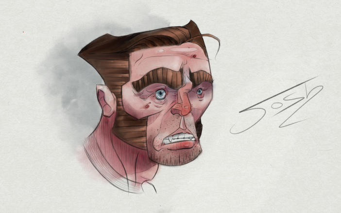
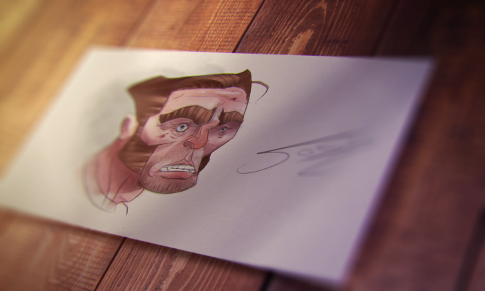
So yeah, digital watercoloring… kinda. I originally sketched this traditionally with a mechanical pencil, then inked it a few days later. I let it lie around for a while and decided to re-sketch the drawing digitally. That sat for a few days as well, as I was really stuck on what to do with the piece.
Recently I’ve been approaching digital art, especially since I’m using Sketchbook Pro, as a kind of traditional art simulator, adding textures, using weird brushes, stuff like that. So I was messing around with some brushes from the weekly Sketchbook Pro blog and noticed that one of the oil painting brushes seemed kind of watery.
It took me an hour to paint the final image. I think there are probably better brushes that I could have used, but in some areas it actually looks pretty nice and watercolory. If I was to go back and fix some stuff, I would desaturate and lighten some of the colors, and also sponge the middle areas to get those dark edges like watercolor in real life. I’ll keep experimenting. I really like the concept of a digital watercolor brush.
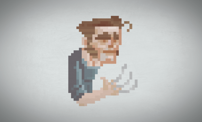
Here’s a pixel drawing I did of the portrait, which I almost animated:
I did record the process of coloring the wolverine portrait, but I want to make a few more videos before I restart my Youtube channel, which, by the way, I might try to upload some tutorials on.
Make sure to share this post on social media, hit the like button if you liked this post, and follow if you want to see more.
Thanks,
Josh M (jumpingmonkeyart@gmail.com)
Hire me here: https://www.upwork.com/freelancers/~01a7233fbd48468c25


 Other than that, these are just a combination of quick anatomy/pose sketches and a bunch of random characters for fun. Everything here was done with a mechanical pencil.


